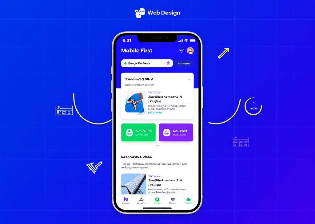
როგორ შევქმნათ მობილურ ტელეფონებზე ორიენტირებული ვებსაიტის გამოცდილება
შესავალი
დღევანდელ სწრაფად განვითარებად ციფრულ სამყაროში, **მობილურ დიზაინზე** გადასვლა მხოლოდ ტენდენცია არ არის; ეს აუცილებლობაა. რადგან ინტერნეტს სმარტფონების საშუალებით უფრო მეტი მომხმარებელი იყენებს, ვიდრე ოდესმე, აუდიტორიის ჩართულობისა და საძიებო სისტემებისთვის ოპტიმიზაციისთვის გადამწყვეტი მნიშვნელობა აქვს ისეთი ვებსაიტის შექმნას, რომელიც მობილურ გამოცდილებას ანიჭებს უპირატესობას. დაფიქრდით: როდის იყო ბოლოჯერ, როდესაც კომფორტულად ნავიგაცია მოახდინეთ საიტზე ტელეფონით, რომელიც უხერხულად და არათანმიმდევრულად გეჩვენებოდათ? იმედგაცრუება იწვევს ინტერესის ნაკლებობას, ხოლო ინტერესის ნაკლებობა - ვიზიტორის დაკარგვას.
**მობილური მოწყობილობების დიზაინის** პრინციპი მოითხოვს, რომ ყველაფერზე წინ გაითვალისწინოთ მობილური მოწყობილობების მომხმარებლების შეზღუდვები და ქცევები. ეს მიდგომა ორმაგ მიზანს ემსახურება: ის არა მხოლოდ აუმჯობესებს მომხმარებლის გამოცდილებას, არამედ იდეალურად შეესაბამება Google-ის მობილურ მოწყობილობებზე ორიენტირებული ინდექსირების სტრატეგიას. თუ გსურთ, რომ თქვენი საიტი პოპულარობას იძენს საძიებო სისტემებში და მომხმარებლების მოხიბვლას შეძლებს, მობილური მოწყობილობების დიზაინის შექმნა აუცილებელია.
კონტენტისა და კონტენტის იერარქიის პრიორიტეტიზაცია
ყველა შესანიშნავი მობილური ვებსაიტის ცენტრში მისი კონტენტი დევს. დაიწყეთ თქვენი კონტენტის საგულდაგულო ინვენტარიზაციით. გაიგეთ, რა არის აუცილებელი თქვენი შეტყობინების ეფექტურად გადმოსაცემად შეზღუდულ სივრცეში. თითოეული ელემენტი მნიშვნელოვანია.
– დაფიქრდით იმ კონტენტზე, რომელიც რეალურ ღირებულებას მოაქვს — რა უნდა იცოდნენ ვიზიტორებმა დაუყოვნებლივ?
– მოიშორეთ ყველაფერი, რაც გამოცდილებას ართულებს. მობილურის ეკრანები პატარაა, ამიტომ ეცადეთ, რომ სიცხადე და შთაბეჭდილება მოახდინოთ.
– თქვენი კონტენტი სტრუქტურირებულ იერარქიაში მოაწყვეთ. მნიშვნელოვანი ელემენტები წინა პლანზე უნდა იყოს განთავსებული, რათა მომხმარებლები ბუნებრივად მიმართონ თქვენს ვებსაიტზე.
წარმოიდგინეთ, რომ საიტზე შედიხართ და მაშინვე ხედავთ ინტერაქტიულ ბანერს, რომელიც თქვენს საყვარელ პროდუქტებზე ფასდაკლებას აცხადებს. სასიამოვნო შეგრძნებაა, არა? ეს არის კონტენტის განზრახ განთავსების ძალა.
დიზაინი სენსორული ეკრანებისა და მომხმარებლის ურთიერთქმედებისთვის
მობილური მომხმარებლები თქვენს საიტზე მაუსის დაწკაპუნების ნაცვლად **შეხებით** სარგებლობენ. ეს ფუნდამენტური განსხვავება მოითხოვს დიზაინს, რომელიც კურსორის ნაცვლად თითებს იტევს.
– შექმენით **დიდი, შეხებით გამოსაყენებელი ღილაკები**, რომლებზეც ნავიგაცია მარტივია მასშტაბირების გარეშე.
– მოერიდეთ მობილურ მოწყობილობებზე მაუსის მიტანის ფუნქციის გამოყენებას, რომელიც სირთულეს მატებს — ის, რაც დესკტოპზე მუშაობს, შესაძლოა კარგად არ ითარგმნოს.
- ნავიგაციისთვის გამოიყენეთ ისეთი ჟესტები, როგორიცაა გადაფურცვლა, დამღლელი ღილაკების დაჭერის ნაცვლად.
წარმოიდგინეთ, როგორ შეუფერხებლად გადაადგილდებით სურათების გალერეაში თითის ერთი მოძრაობით. განა ეს უფრო მიმზიდველად არ გეჩვენებათ, ვიდრე ვიწრო ეკრანზე პაწაწინა ბმულებთან ბრძოლა?
ნავიგაციის ოპტიმიზაცია სიმარტივისა და გამოყენებადობისთვის
ვებ დიზაინში არსებობს გამონათქვამი: „თუ ადვილი არ არის, ესე იგი, სწორი არ არის“. ეს განსაკუთრებით მობილური ნავიგაციისთვისაა დამახასიათებელი.
– მენიუები **მარტივი** შეინახეთ. ეცადეთ, მაქსიმუმ 4–8 კერძი შეიცავდეს — საკმარისია იმისათვის, რომ ინფორმაცია მოგაწოდოთ ზედმეტი ინფორმაციის გარეშე.
– ძირითადი კატეგორიებისთვის დანერგეთ ვერტიკალური ჩამოსაშლელი სიები, დაზოგეთ სივრცე და ამავდროულად შესთავაზეთ ვარიანტები.
– თქვენი ლოგოს მთავარი ღილაკის სახით განთავსება არა მხოლოდ პრაქტიკული, არამედ ინტუიციურია, რაც მომხმარებლებს ნაცნობ შეხების წერტილს სთავაზობს.
წარმოიდგინეთ: მთავარ გვერდზე მოხვედრის შემდეგ მეტის გაგება გსურთ. ლაკონური ნავიგაციის წყალობით, მხოლოდ რამდენიმე შეხებით, ზუსტად იქ ხართ, სადაც გსურთ იყოთ. ეს მოქნილობა შემდგომ შესწავლას იწვევს.
დანერგეთ რეაგირებადი განლაგებები პროგრესული გაუმჯობესებით
რესპონსიული დიზაინი თქვენი საუკეთესო მოკავშირეა, რათა უზრუნველყოთ თქვენი საიტის კარგად მუშაობა სხვადასხვა მოწყობილობებზე. დაიწყეთ მისი შექმნა ყველაზე პატარა ეკრანებისთვის და გაზარდეთ მასშტაბი.
– დანერგეთ **მოქნილი ბადისებრი** სისტემა, რომელიც ელემენტებს შეუფერხებლად აწესრიგებს და სხვადასხვა გარჩევადობას ითვალისწინებს.
– დიდი ეკრანებისთვის შესაფერისი გაუმჯობესებების დამატებამდე დაიწყეთ მყარი მობილური საფუძვლით.
– ყოველთვის შეინარჩუნეთ ბრენდინგი ხელუხლებელი, რაც უზრუნველყოფს იდენტიფიცირებად გამოცდილებას მოწყობილობის მიუხედავად.
წარმოიდგინეთ, რა სასიამოვნოა ლამაზად შექმნილი საიტის ნახვა, რომელიც შეუფერხებლად გადადის კომპაქტური მობილური განლაგებიდან დესკტოპისთვის განკუთვნილ ვერსიაზე. ეს პროფესიონალიზმს და დეტალებზე ორიენტირებულობას გადმოსცემს.
სიჩქარისა და შესრულების ოპტიმიზაცია
სიჩქარე მობილური მოწყობილობებისთვის პრიორიტეტული რეცეპტის აუცილებელი ინგრედიენტია. მომხმარებლები არ დაელოდებიან ნელი ჩატვირთვის დროს; ისინი წავლენ და შესაძლოა აღარასდროს დაბრუნდნენ.
– სურათების შეკუმშვა და არასაჭირო სკრიპტების ზუსტად აღმოფხვრა — ნაკლები მეტია.
– შეფერხებების თავიდან ასაცილებლად გამოიყენეთ ასინქრონული ჩატვირთვის მეთოდები.
– მოერიდეთ შემაწუხებელ pop-up აპებს, რომლებიც, როგორც ცნობილია, ვიზიტორებს აღიზიანებს და აიძულებს მათ უკან დაიხიოს.
გაითვალისწინეთ შემდეგი: სწრაფად ჩატვირთული მობილური საიტი შეიძლება გადამწყვეტი იყოს მომხმარებლის მიერ პროდუქტის შეძენასა და კალათის საერთოდ მიტოვებას შორის. სიჩქარე გადამწყვეტი ფაქტორია.
გაითვალისწინეთ ხელმისაწვდომობა და SEO
ხელმისაწვდომობის გათვალისწინებით დიზაინის შექმნა აფართოებს თქვენს აუდიტორიას. გახადეთ თქვენი საიტი მიმზიდველი ყველა მომხმარებლისთვის.
– სიცხადისთვის გამოიყენეთ მაღალი კონტრასტის მქონე, ადვილად წასაკითხი შრიფტები.
– დარწმუნდით, რომ შეხების სამიზნეები საკმარისად დიდია კომფორტული ურთიერთქმედებისთვის.
– არ დაგავიწყდეთ სურათებისთვის აღწერითი alt ტექსტის დამატება — ეს აუმჯობესებს როგორც მომხმარებლის გამოცდილებას, ასევე SEO-ს.
წარმოიდგინეთ მხედველობადაქვეითებული მომხმარებელი, რომელიც თქვენს ულამაზესად შექმნილ საიტზე უპრობლემოდ ნავიგაციას ახორციელებს. ეს არის თანაგრძნობისა და ფუნქციონალურობის ნაზავი, რაც მობილურ ტელეფონზე ორიენტირებულ ვებსაიტს გამოარჩევს.
ჩაატარეთ ფართომასშტაბიანი ტესტირება სხვადასხვა მოწყობილობებზე
გაშვებამდე, სხვადასხვა ტიპის მოწყობილობებზე საფუძვლიანი ტესტირება უდავოა.
– შეაფასეთ თქვენი საიტი რეალურ მოწყობილობებზე — ემულატორები უბრალოდ არ არიან შესაფერისი.
– დაადგინეთ განლაგების შესვენებები, შეასწორეთ ნებისმიერი რთული შეხების სამიზნე და აღმოფხვრეთ ნელი ჩატვირთვის დრო.
– ჩაატარეთ გამოყენებადობის ტესტები, შეაგროვეთ უკუკავშირი რეალური მომხმარებლებისგან თქვენი დიზაინის დახვეწის მიზნით.
მომხმარებლის უკუკავშირს ვერაფერი შეედრება იმის გარკვევაში, თუ რა მუშაობს ნამდვილად და რა საჭიროებს გაუმჯობესებას. თქვენ ვერ გამოუშვებთ პროდუქტს მისი ტესტირების გარეშე და ვებსაიტიც არ უნდა იყოს გამონაკლისი.FINDDOMAIN.GE (შპს ინტერნეტ სერვისები) ძალიან საინტერესო და სწრაფად განვითარებადი IT კომპანიაა. ძირითადი მიმართულებებია: ვებ-განვითარება, დომენები და ვებ-ჰოსტინგი. ის ასევე სთავაზობს კლიენტებს ძირითად სერვისებთან დაკავშირებულ ქვე-მომსახურებას და აუთსორსინგს.
საუკეთესო შეთავაზებები:
გსურთ შექმნათ თქვენი საკუთარი კომპანიის ვებსაიტი ან შექმნათ თქვენი საკუთარი ონლაინ ბიზნესი ინტერნეტში?
– ვებ ჰოსტინგი
– დომენის რეგისტრაცია
– ვებ-განვითარება
– საიტის შემქმნელი


„html“
გამოიყენეთ ანალიტიკა თქვენი დიზაინის არჩევანის ინფორმირებისთვის
როდესაც მობილურ მოწყობილობებზე ორიენტირებულ ვებსაიტს შექმნით, გამოიყენეთ... ანალიტიკათქვენს საიტზე მომხმარებლის ქცევის გაგება ფასდაუდებელია უწყვეტი გაუმჯობესებისთვის.
- ძირითადი მეტრიკის თვალყურის დევნებისთვის გამოიყენეთ ისეთი ინსტრუმენტები, როგორიცაა Google Analytics - ბაუნს-რაიტები, სესიის საშუალო ხანგრძლივობა და გვერდის ნახვები მომხმარებლის ჩართულობის შესახებ მკაფიო ინფორმაციას იძლევა.
- აკონტროლეთ, რომელი გვერდები მუშაობს კარგად და რომელი არა. შეცვალეთ თქვენი კონტენტის სტრატეგია იმის მიხედვით, თუ რასთან აქტიურად ურთიერთობენ მომხმარებლები.
- რეგულარულად დააყენეთ A/B ტესტირება, რათა შეადაროთ სხვადასხვა განლაგება, მოწოდებისკენ სწრაფვა ან ნავიგაციის სტრუქტურები და ნახოთ, რომელია ყველაზე მეტად რეზონანსული თქვენს აუდიტორიასთან.
წარმოიდგინეთ, რომ ზუსტად იცით, თუ სად მიდიან მომხმარებლები კონვერტაციის ძაბრში. ეს მონაცემები საშუალებას გაძლევთ განახორციელოთ ინფორმირებული კორექტირება, რაც ეფექტურად გააუმჯობესებს მომხმარებლის მოგზაურობას.
უწყვეტი გაუმჯობესებისთვის უკუკავშირის მარყუჟების დანერგვა
მობილურ მოწყობილობებზე ორიენტირებული ვებსაიტის შექმნა გაშვების შემდეგ არ მთავრდება; ის მოითხოვს მიმდინარე დახვეწაშექმენით უკუკავშირის მარყუჟები, რომლებიც მომხმარებლებს საშუალებას მისცემს გაუზიარონ ერთმანეთს თავიანთი გამოცდილება.
- ინტეგრირეთ უკუკავშირის ფორმები ან გამოკითხვები პირდაპირ თქვენს ვებსაიტში. დასვით კონკრეტული კითხვები, რომლებიც დაგეხმარებათ გაიგოთ თქვენი მობილური განლაგების გამოყენებადობა.
- წაახალისეთ რეკომენდაციები და მიმოხილვები, რომლებიც აჩვენებს, თუ რამდენად კარგად ემსახურება თქვენი საიტი თავის დანიშნულებას.
- გააანალიზეთ მომხმარებელთა მომსახურების ურთიერთქმედება. ხშირად წამოჭრილი საკითხები დაგეხმარებათ განსაზღვროთ ის სფეროები, რომლებიც გაუმჯობესებას საჭიროებს.
უკუკავშირი თქვენი GPS ვებ დიზაინის გზაზე — რომელიც დაგეხმარებათ გაუმჯობესებებისკენ, რაც მომხმარებლებს თქვენს მხარეს შეინარჩუნებს.
იყავით ინფორმირებული მობილური ტენდენციებისა და ტექნოლოგიების შესახებ
ვებ-ლანდშაფტი მუდმივად ვითარდება. იყავით აწმყოში მობილური ვებ დიზაინის ახალი ტენდენციებისა და ტექნოლოგიების გაცნობით.
- რეგულარულად მოიხმარეთ კონტენტი ისეთი რესურსებიდან, როგორიცაა Smashing Magazine ან მომხმარებლის ინტერფეისის დიზაინიისინი ხშირად მოიცავს რეაგირებადი დიზაინის ტექნიკის, ხელმისაწვდომობის სტანდარტებისა და მომხმარებლის გამოცდილების საუკეთესო პრაქტიკის მიღწევებს.
- ექსპერიმენტი ჩაატარეთ ახალი ხელსაწყოებით, რომლებსაც შეუძლიათ სიჩქარისა და ფუნქციონალურობის გაუმჯობესება, როგორიცაა პროგრესული ვებ აპლიკაციები (PWA) ან მობილური მოწყობილობებისთვის განკუთვნილი ჩარჩოები.
წარმოიდგინეთ, რა აღფრთოვანებას იწვევს ტექნოლოგიაში რევოლუციური ცვლილების მოწმეობა, რომელიც მომხმარებლის გამოცდილებას ცვლის - განახლებული ინფორმაცია თქვენს ვებსაიტს აქტუალურს და მიმზიდველს ხდის.
შექმენით მოქმედებისკენ მიმზიდველი მოწოდებები
ნებისმიერი ვებსაიტის აუცილებელი კომპონენტია მოწოდება მოქმედებისკენ (CTA). ეს თქვენი მობილური დიზაინიც ისეთივე კაშკაშა უნდა იყოს.
- დარწმუნდით, რომ მოწოდების ძალაშია მკაფიო, ლაკონური და დამაჯერებელიგამოიყენეთ ქმედითი ენა, რომელიც მომხმარებლებს შემდეგი ნაბიჯის გადადგმისკენ მოუწოდებს — იქნება ეს საინფორმაციო ბიულეტენზე გამოწერა თუ შენაძენის განხორციელება.
- სტრატეგიულად განათავსეთ თქვენი მოწოდებისკენ სწრაფვის ფრაზები კონტენტის ნაკადში, რათა უზრუნველყოთ, რომ ისინი ადვილად ხელმისაწვდომი იყოს და არ იგრძნოთ თავი შემაწუხებლად.
- ფორმატზეც ექსპერიმენტი ჩაატარეთ — ღილაკები ბმულებზე უკეთესად გამოიყურება? სცადეთ სხვადასხვა ვარიაციები.
წარმოიდგინეთ მომხმარებელი, რომელიც თქვენს მობილურ საიტს ათვალიერებს და ძალისხმევის გარეშე იღებს რეკომენდაციას, რომ იმოქმედოს დაძაბულობის გარეშე. ამ სიმარტივეს შეუძლია თქვენი კონვერტაციის მაჩვენებლები მკვეთრად გაზარდოს.
ისარგებლეთ მობილური მოწყობილობებისთვის პრიორიტეტული ინდექსირების უპირატესობებით
რადგან საძიებო სისტემები აგრძელებენ ადაპტაციას, მობილურ ტელეფონზე ორიენტირებული ინდექსირების გამოყენება მხოლოდ თქვენს ხილვადობასა და რეიტინგს შეუწყობს ხელს.
- დარწმუნდით, რომ ყველა შესაბამისი კონტენტი ხელმისაწვდომია და ოპტიმიზებულია მობილური მომხმარებლებისთვის. ეს ნიშნავს, რომ სურათები, ვიდეოები და კრიტიკული ინფორმაცია უნდა იყოს ხელმისაწვდომი და სწრაფად ჩატვირთული.
- დარწმუნდით, რომ მობილური საიტის ყველა ელემენტი ასევე აკმაყოფილებს SEO-ს საუკეთესო პრაქტიკას - არ უნდა უგულებელვყოთ სათაურის თეგები, მეტა აღწერილობები და სქემის მარკირება.
დაფიქრდით საძიებო სისტემების მიერ პრიორიტეტულობის მინიჭების უპირატესობაზე — თქვენი მომსახურების ან პროდუქტების მაძიებელი პოტენციური მომხმარებლების ყურადღების ცენტრში მოხვედრაზე.
წარმატების გაზომვა და შესაბამისად კორექტირება
და ბოლოს, წარმატება სტატიკური არ არის; ის ვითარდება. რეგულარულად გადახედეთ თქვენი საიტის მუშაობას და საჭიროებისამებრ შეასწორეთ.
- დაგეგმილი ინტერვალებით ხელახლა გადახედეთ თქვენს ანალიტიკას, რათა შეაფასოთ, მიიღწევა თუ არა თავდაპირველად დასახული მიზნები. თუ არა, უფრო ღრმად ჩაუღრმავდით მონაცემებს ანალიზისთვის.
- თვალყური ადევნეთ კონკურენტ საიტებს, რათა აღმოაჩინოთ წარმატებული სტრატეგიები და შთაგონება თქვენი გაუმჯობესებისთვის.
- შეინარჩუნეთ მოქნილობა და ადაპტირება. ონლაინ სამყარო დინამიურია და თქვენი საიტიც დინამიური უნდა იყოს.
კმაყოფილება, რომელიც თქვენი გაუმჯობესებების შედეგის ხილვით მოდის, შეუდარებელია. მომხმარებლები თავს დაფასებულად გრძნობენ და საძიებო სისტემები გაჯილდოვებენ უკეთესი ხილვადობით.
შთაგონება მობილური მოწყობილობებისთვის პრიორიტეტული დიზაინის შესახებ
მობილური მოწყობილობებისთვის პრიორიტეტული დიზაინის შესახებ თქვენი ცოდნის გასაღრმავებლად და კრეატიულობის გასაღვივებლად, იხილეთ ეს საინტერესო ვიდეოები:
- მობილურისთვის პრიორიტეტული დიზაინის პრინციპები
- რესპონსიული ვებ დიზაინი: ვებსაიტების მომავალი
- მობილურისთვის დიზაინი: რჩევები და ხრიკები
ეს რესურსები დაგეხმარებათ მობილური დიზაინის ნიუანსებში გაერკვეთ, რაც ხელს შეუწყობს მომხმარებლის გამოცდილების სრულყოფილად გააზრებას, რაც აქტუალურია დღევანდელ მობილურ სამყაროზე ორიენტირებული ვერსიებისთვის.
</br><a target="_blank" href="https://www.finddomain.ge/en/">FINDDOMAIN.GE (შპს ინტერნეტ სერვისები) ძალიან საინტერესო და სწრაფად განვითარებადი IT კომპანიაა. ძირითადი მიმართულებებია: ვებ-განვითარება, დომენები და ვებ-ჰოსტინგი. ის ასევე სთავაზობს კლიენტებს ძირითად სერვისებთან დაკავშირებულ ქვე-მომსახურებას და აუთსორსინგს.</a>
<br/><br/>
<hr>
<strong>
საუკეთესო შეთავაზებები:<br/>
გსურთ შექმნათ თქვენი საკუთარი კომპანიის ვებსაიტი ან შექმნათ თქვენი საკუთარი ონლაინ ბიზნესი ინტერნეტში? </strong>
<a target="_blank" href="https://www.finddomain.ge/en/hosting/">- ვებ ჰოსტინგი</a>
<a target="_blank" href="https://billing.finddomain.ge/cart.php?a=add&domain=register&language=english">- დომენის რეგისტრაცია</a>
<a target="_blank" href="https://www.finddomain.ge/en/web-development/">- ვებ-განვითარება</a>
<a target="_blank" href="https://www.finddomain.ge/site-builder/">- საიტის შემქმნელი</a>
</br>
<a href="https://www.finddomain.ge/en/hosting/" target="_blank" rel="noopener"><img src="https://besthosting.ge/wp-content/uploads/2025/08/hosting-banner_en.jpg" /></a>
</br>
<a href="https://billing.finddomain.ge/cart.php?a=add&domain=register&language=english/" target="_blank" rel="noopener"><img src="https://besthosting.ge/wp-content/uploads/2025/08/domain-registration-en.jpg" /></a>
</br>
<a href="https://www.finddomain.ge/en/web-development/" target="_blank" rel="noopener"><img src="https://besthosting.ge/wp-content/uploads/2025/08/web-development-en.png" /></a>
</br>


