
Why responsive web design is crucial in 2025
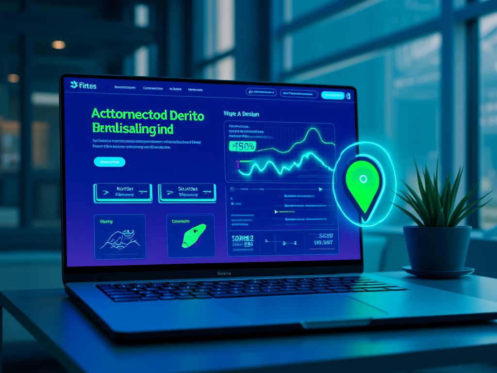
Responsive web design is more than a buzzword; in 2025, it is the foundation upon which successful digital experiences are built. Picture this: a sleek, modern website that effortlessly transitions from a crisp desktop layout to a mobile format that feels as natural as breathing. With users moving between myriad devices—smartphones, tablets, laptops, and even smart TVs—the adaptability of a website is no longer an option; it's a necessity that can make or break a business in a hyper-competitive market.
The Age of Mobile Dominance
Let’s drop a few statistics that hit hard: over 65% of global internet traffic arrives from mobile devices. Close your eyes and imagine your audience—time-crunched, on-the-go, frantically scrolling through their feeds to find something that captures their attention. If your website appears clunky or doesn't load seamlessly, you've lost them in seconds. Each second counts. Research shows that a one-second delay in load time can lead to a 7% reduction in conversions. Is your site fluid enough to keep pace?
Connectivity Beyond The Smartphone
In 2025, the variety of devices accessing the web has exploded. Your potential customers aren't just popping onto their phones; they’re switching between various platforms: smartwatches that beep notifications on their wrist, voice-activated home assistants that play Podcasts during breakfast, and even smart TVs that allow binge-watching while multitasking. Responsive web design doesn’t just change the layout; it ensures every user interaction feels intuitive, no matter the context or device.
SEO: The Invisible Driver
Let’s be honest: if search engines don’t like your site, neither will your audience. Google’s mobile-first indexing prioritizes sites that provide a mobile-optimized experience. In 2025, if your website isn’t responsive, you could find yourself buried in search results, watching competitors surge ahead with better visibility. Think of your URL as a bastion that defends your brand against the penalties of duplicate content and poor organic traction. A single, responsive URL means a stronger digital presence and clearer focus for your SEO efforts.
Did you know that responsive websites enjoy 50% more traffic and a 20% increase in conversion rates? Your business’s bottom line isn't just impacted by your design; it’s boosted when customers find what they need quickly and efficiently.
The Experience: UX is King
Imagine navigating a beautiful site on your smartphone, where buttons are large, navigation’s a breeze, and content whispers, “Stay awhile.” Over 75% of online purchases happen on mobile, which translates to a massive opportunity if your site feels irresistible. User experience (UX) is integral to conversion; a responsive design can enhance metrics like time on site and reduce bounce rates. A tailored experience is one that keeps customers engaged—not frustrated—a fact that can elevate your engagement metrics by up to 400%.
The Financial Wisdom Behind Responsive Design
Now let’s talk dollars and cents. Maintaining two separate versions of your website—one for desktop and one for mobile—is not just inefficient; it’s expensive. Each update, each tear in your budget grows wider when you have to juggle multiple sites. A single responsive site means streamlined development, consistent updates, and fewer headaches when it comes to content management. This efficiency paves the way for greater profitability.
Preparing for the Future
New technologies emerge daily. Have you considered foldable phones or the latest iterations of wearables? A responsive design future-proofs your online presence, ensuring compatibility with devices that haven’t even hit the market yet. This adaptability isn’t just smart; it reflects a brand that’s aware of its evolving audience and ready to embrace change.
Practical Strategies for Responsive Design
- Utilize flexible grids and CSS media queries that enable your layout to flex with changing screen sizes.
- Optimize images through adaptive formats that ensure quick loading times without sacrificing quality.
- Ensure navigation remains intuitive, focusing on touch-friendly icons and clear calls to action that don’t require users to zoom in.
- Implement lazy loading techniques to boost speed—remember, quick load times aren’t just nice; they keep users on your page.
Illustrative Example Table: Benefits of Responsive Web Design in 2025
| Benefit | Impact Statistic or Fact | Business Outcome |
|---|---|---|
| Increased Traffic | Responsive sites get 50% more traffic | Higher customer acquisition |
| Improved Conversion | Mobile-optimized sites see 20%+ conversion lift | More sales and revenue |
| SEO Ranking Boost | Google’s mobile-first indexing prioritizes responsive sites | Better visibility and organic search traffic |
| Cost Efficiency | One site to maintain saves development and update costs | Lower operational expenses |
| Faster Loading Times | AMP reduces load time by 85% | Improved user satisfaction and retention |
In a world where digital interactions dominate our lives, responsive web design is a commitment to your audience, a promise that you understand their needs and are ready to fulfill them with grace and efficiency. It’s more than aesthetics; it’s a strategy grounded in customer engagement, SEO significance, and financial pragmatism. As we move forward, we’ll delve deeper into the intricate strategies and methodologies necessary to truly make your responsive design resonate with users on every platform.
FINDDOMAIN.GE (Internet services LLC) is a very interesting and rapidly developing IT company. The main directions are: web development, domain and web hosting. It also offers clients sub-services and outsourcing related to the main services.
BEST OFFERS:
Do you want to create your own company website or create your own online business on the Internet?
– WEB HOSTING
– DOMAIN REGISTRATION
– WEB DEVELOPMENT
– SITE BUILDER


Embracing Adaptive Design Techniques
As we delve deeper, let’s explore two original approaches that can elevate your responsive web design strategy: Context-aware Responsiveness and AI-Powered Responsive Adaptation. These methodologies push the boundaries of how users engage with your site, creating a more personalized experience.
Context-aware Responsiveness
Imagine a website that not only responds to screen size but also adjusts its content based on user context. For instance, a returning visitor may be shown tailored recommendations based on previous visits, time of day, or even their current location. Such dynamic interaction can profoundly enhance user engagement, making visitors feel understood and valued.
-
Real-Time Adaptation: By harnessing geolocation data, your site might show local information, such as store hours or nearby products. Tailoring offers based on weather can excite users—think promoting umbrellas during rainy seasons!
-
Behavior Analysis: Keep tabs on how users interact. If users tend to avoid a specific section, consider reshaping that content or moving it elsewhere. This nimbleness nurtures a website that evolves alongside its visitors, cultivating loyalty.
AI-Powered Responsive Adaptation
Enter the realm of artificial intelligence. AI tools can analyze user behavior in real-time, optimizing layouts and media for various devices automatically. This technology adapts not just to physical screens, but also to user habits and preferences, enhancing the overall experience without requiring constant manual intervention.
-
Automated Design Adjustment: Automate the fine-tuning process—imagine a system that learns which page elements draw the most attention, gradually shifting layout designs to highlight those features optimally based on device type.
-
Enhanced Performance Analytics: AI tools continually learn from interactions, observing which design tweaks yield the best outcomes. Get ready to leverage such insights to elevate conversion rates and minimize bounce rates effectively.
Performance Metrics to Consider
When measuring the success of responsive design, focus on key performance indicators (KPIs) that align with your business goals:
-
Bounce Rate: A high bounce rate may signify that visitors aren’t finding what they need quickly enough. Responsive design should lower bounce rates, especially when optimized for mobile.
-
Engagement Metrics: Monitor how long users spend on your site. An increase typically correlates with a more engaging UX fueled by responsive design.
-
Conversion Rate: As we discussed, a well-executed responsive design could boost sales conversions significantly. Keep an eye on sales figures and funnel performance to ensure alignment with optimized design.
Preparing for the Next Wave of Technology
As we look ahead, consider how emerging technology will continue to shape web design. Voice search, augmented reality (AR), and virtual reality (VR) are on the horizon, influencing how users interact with digital content. Your responsive design must adapt not just to devices, but also to these new modalities of interaction.
-
AR and VR Integration: Allow users to engage with 3D products on your site, for example. This immersive experience can blend seamlessly with responsive design to ensure that all users, regardless of their devices, can interact with products in a way that feels natural and engaging.
-
Inclusive Design: As we embrace diverse devices and methods of interaction, remember that accessibility is paramount. Foster an inclusive platform that ensures everyone can navigate and interact comfortably—this can elevate brand loyalty and enhance your reputation.
Crafting an Immersive User Journey
At the heart of responsive design lies a commitment to an immersive user journey. Every click, every swipe shapes a visitor's experience. With intelligent design systems that anticipate user needs, prioritize speed, and embrace adaptability, brands will be poised to engage users meaningfully and ensure high-flux interactions.
Effective Case Studies and Their Lessons
Take, for instance, the case of Company XYZ, a leading e-commerce platform that revamped its website to a fully responsive design. Following this change, they reported a staggering 60% increase in mobile sales and a substantial drop in bounce rates. Their mixed media approach to product showcasing was intuitive and responsive, ensuring users of all devices felt catered to without friction.
As we continue to evolve into the digital landscape, learning from such successful case studies is paramount. They solidify the importance of responsive design as not merely an enhancement but a critical necessity.
Conclusion
In 2025, responsive web design won’t merely be one of many strategies; it will be the bedrock of successful online businesses. The brand that recognizes and embraces this necessity will stand apart, creating not just websites but memorable experiences. Whether it’s through context-aware responsiveness, implementing AI technologies, or preparing for the next wave of innovations, it's clear: the path to success is paved with adaptability.
Relevant Video Resources
For those eager to dive deeper into the world of responsive web design, check out these insightful videos that provide further context and practical strategies:
Focus on why responsive design is crucial not only for user engagement but also for harnessing the tremendous power of technology to craft unforgettable digital experiences. The web isn’t going to slow down; neither should your website.
References
- Responsive Web Design: What It Is and How to Use It
- Google Developers: Responsive Web Design Basics
- Responsive vs. Adaptive Design: What's the Difference?
- The Importance of Responsive Design
- Web Performance Optimization: Understanding Load Time
FINDDOMAIN.GE (Internet services LLC) is a very interesting and rapidly developing IT company. The main directions are: web development, domain and web hosting. It also offers clients sub-services and outsourcing related to the main services.
BEST OFFERS:
Do you want to create your own company website or create your own online business on the Internet?
– WEB HOSTING
– DOMAIN REGISTRATION
– WEB DEVELOPMENT
– SITE BUILDER
![Web Development Services in [Local Area] for E-commerce](https://besthosting.ge/wp-content/uploads/2025/08/web-development-services-ecommerce-local-area.jpg)
![Small Business Website Development in [City/Neighborhood]](https://besthosting.ge/wp-content/uploads/2025/08/small-business-website-development-in-city-neighborhood.jpg)
 English
  Georgian