Mobile-first web design trends for better user engagement
Meta description:
Discover the latest mobile-first web design trends for 2025 that boost user engagement, improve UX, and increase conversions by prioritizing mobile experiences.
Introduction
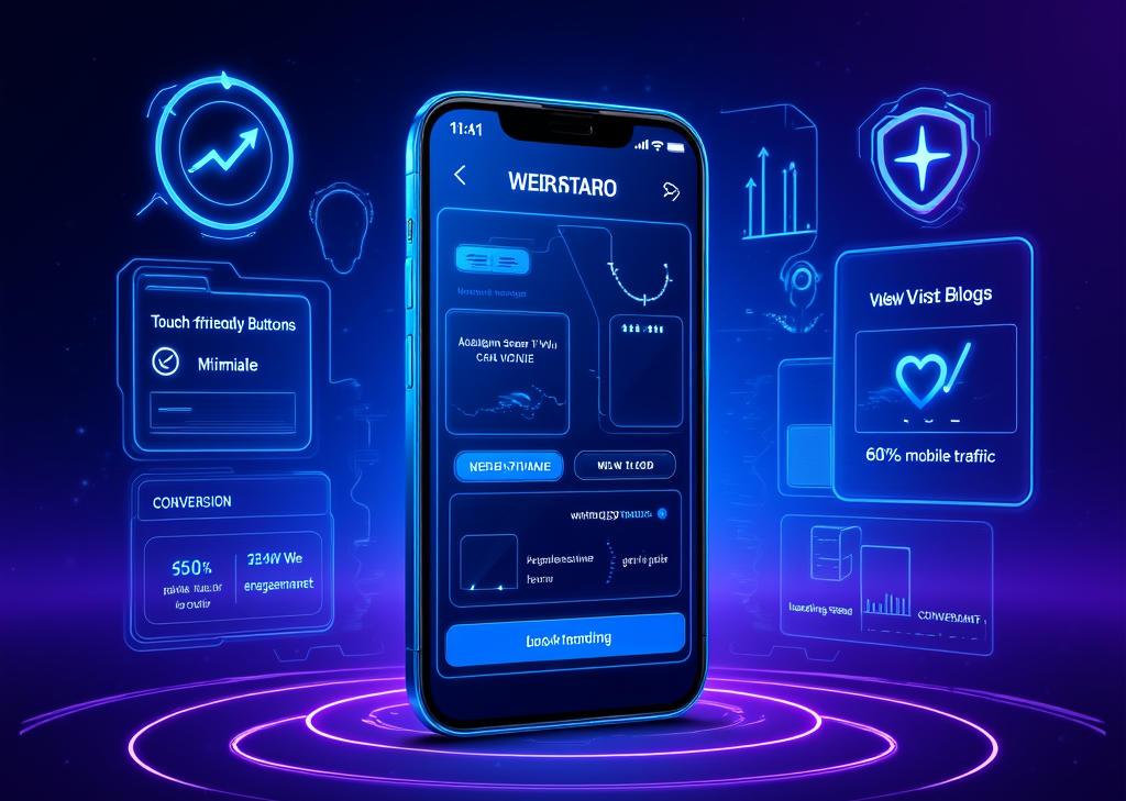
In an age where our smartphones are practically an extension of ourselves, the web has evolved, much like fashion trends. As we flick through the daily flood of messages, memes, and media, one thing is for sure—mobile devices account for over 60% of global web traffic. If your website is flat, unresponsive, and clunky on mobile, you might as well be whispering into the void. It's time for a reality check: mobile-first web design isn’t a luxury; it’s an absolute necessity for businesses wanting to maximize user engagement and conversions.
What is mobile-first web design and why it matters
Imagine this: You’re at a bustling café, the sound of steaming lattes fills the air. All you want is a quick scroll to find a decent restaurant nearby. Your phone’s small screen barely showcases the cluttered webpage you're stuck on. Instead of a quick bite, you end up with a headache. This kind of experience is precisely what mobile-first design seeks to eradicate.
Mobile-first design starts the creative process by focusing on the smallest screen first, like smartphones, before expanding outward to tablets and desktops. Think of it as assembling a paper plane—start small, nail the fundamentals, then add more angles for those fancy flips. By prioritizing content, usability, and performance, design can better serve users facing the confines of limited real estate.
Here are some must-implement steps for mobile-first design:
-
Understand mobile user needs: Explore what makes mobile users tick with their unique goals and behaviors. Think quick access, seamless navigation, and minimal distractions.
-
Sketch smallest screen first: Craft your layouts with the smallest screens in mind. This prioritizes essential content and strips away all the fluff.
-
Define a clear content hierarchy: Structure the site so that users immediately see critical content out of the gate. Think of it as laying the groundwork for an engaging first impression.
-
Design touch-friendly interfaces: Adjust button sizes and spacing to cater to finger taps. No one wants to poke the wrong link when hungry!
-
Use responsive frameworks: Frameworks that adapt layouts based on screen size ensure that your hard work shines through on all devices.
-
Optimize performance: Compress images and minimize code to boost load times. Remember, mobile users want to feel satisfaction in an instant, not frustration.
-
Test on real devices: Embrace real-device testing tools to confirm that users on different smartphones and tablets enjoy the same level of performance and experience.
So why is this mobile-first approach so pivotal?
-
A staggering 60% of global web traffic now flows from mobile devices. If your website stumbles on mobile, you're losing the majority of potential visitors.
-
Mobile users expect pages to load within an instant—2 seconds, to be exact. A slow site is the quickest way to find a user gone like a flash.
-
Websites failing to optimize for mobile will lose up to 53% of users who abandon sites that falter under mobile conditions.
-
Google’s mobile-first indexing uses the mobile version of a website as a primary source for indexing, meaning if you want to pop up in search results, you better be on top of your mobile game.
Emerging mobile-first design trends in 2025 to boost engagement
Keeping a web presence fresh, relevant, and mobile-oriented means staying ahead with design innovations that put user engagement at the forefront, all while creating fluid experiences.
Some top trends to look out for:
-
Touch-based interface enhancements: In 2025, tapping, swiping, and pinching should feel as natural as breathing. Every button, menu, and interface element must be optimized for human interaction. Imagine flipping through your favorite magazine digitally—smooth, intuitive, and effortless.
-
Minimalist and content-focused layouts: With attention spans shortening, streamlined design attracts users like moths to a flame. A clean interface directs focus to the key content, wielding simplicity as a powerful tool. Minimalist design becomes meaningful, creating a balance between aesthetics and usability.
-
Fast loading via performance optimization: Nothing kills engagement like a lagging website. With the expectation for speed never higher, techniques like lazy loading, optimizing images, and seamless coding can reduce load times and keep users glued to the experience.
-
Seamless navigation: Embrace user-friendly solutions like hamburger menus and swipe gestures. Just like a well-worn path through a dense forest, good navigation enables users to find their way without feeling overwhelmed.
-
Responsive and adaptive typography: Engage mobile users by ensuring that fonts are not just readable but also striking. As we step into 2025, experimental typography could infuse visual drama without losing clarity—a balancing act of aesthetics and comprehension.
-
Dark mode and accessibility: More than just a visual preference, dark mode caters to prolonged viewership and battery conservation—two major benefits for mobile users. Features such as larger buttons and voice-activated interfaces also cater to a broader audience, ensuring your site is open to all.
-
Micro-interactions and motion design: Small animations spark joy in the user experience while not weighing down page performance. Think of it as a heartbeat—subtle, yet it gives life to the web.
-
Multimedia integration: Used wisely, images and videos can increase interaction rates significantly. When strategically placed above the fold, they captivate attention, keeping users engaged longer.
-
Progressive enhancement: Start with the simplest mobile designs and leverage additional features for larger screens, allowing your site to evolve gracefully without losing its essence.
Practical tips for applying mobile-first design and boosting user engagement
When applying mobile-first design principles, drill down into the practical details that align with the mobile behaviors and expectations of users:
-
Prioritize above-the-fold content: Seize those precious first seconds by placing your most compelling calls to action, headlines, and critical information right where the eye naturally lands.
-
Follow natural eye patterns: Employing UX design layouts like F or Z can illuminate where mobile users instinctively look, ensuring you meet their gaze with engaging elements.
-
Personalize content: No one enjoys generic experiences. A staggering 74% of users feel flustered by poorly tailored content, so endeavor to offer personalized interactions to retain their interest.
-
Optimize calls to action: Artistic yet bold CTAs can drive impressive conversions. Use eye-catching colors and clear positioning to ensure you compel users to act, even on the smallest screens.
-
Test across devices and scenarios: Using real-device testing clouds lets you explore your site’s performance under various conditions—lack of Wi-Fi, a sinking battery, or the infamous rush-hour commute.
-
Ensure secure and trustworthy experiences: Trust grows in safe environments. SSL certificates and transparent communication about data privacy can turn cautious visitors into loyal users.
-
Incorporate gamification elements: Engage your audience with thoughtfully designed gamification elements that increase time spent on your site when formatted with mobile devices in mind.
Mobile-first web design is not just about structuring for screens; it's an art form that translates into real-life experiences. With a solid grasp of what matters to users, paired with emerging trends and practical techniques, you'll be equipped to elevate engagement. As web design hurtles into 2025, adopting these principles will act as a cornerstone for businesses aiming to thrive in an increasingly mobile world.
FINDDOMAIN.GE (Internet services LLC) is a very interesting and rapidly developing IT company. The main directions are: web development, domain and web hosting. It also offers clients sub-services and outsourcing related to the main services.
BEST OFFERS:
Do you want to create your own company website or create your own online business on the Internet?
– WEB HOSTING
– DOMAIN REGISTRATION
– WEB DEVELOPMENT
– SITE BUILDER


Applying Your Mobile-First Design Strategy
So, you've laid down the groundwork for a mobile-first approach. Now it’s time to apply these strategies holistically. Every design decision, from layout to color, should resonate with mobile users. Who are these users? They are busy, often multitasking, often seeking immediate satisfaction. Thus, your site needs to be a live wire, always responsive, always ready—like a beautiful shop on a bustling street, calling eager customers inside.
Holistic Integration of Design Elements
Start thinking of your website as an organism rather than a static entity. Every element should work together to create an experience, not just serve a functional purpose. Here’s how:
-
Consistent branding: Ensure that your brand voice, color schemes, and typography remain unified across all pages, strengthening recognition.
-
Visual storytelling: Use images and videos that echo your brand’s message. Instead of paragraphs of text that can be daunting on mobile, think in snapshots and bites of information. For example, engaging videos unroll the story in a way that keeps the user captivated. Check out some filming techniques in this concise guide: Creative Video Production Tips.
-
Feedback loops: Incorporate user feedback mechanisms to understand pain points and areas of improvement. An embedded survey with quick, tappable reactions can be a game changer in understanding navigation issues.
Testing and Iteration
It's easy to fall into the trap of thinking design is a one-and-done process. This couldn’t be further from the truth. Continuous testing, analysis, and iteration are crucial:
-
A/B testing: Experiment with different layouts, CTAs, and color schemes to identify what resonates best with users. Use tools like Google Optimize or Optimizely for valuable insights.
-
Analytics: Dive deep into your analytics. Are users dropping off on a particular page? Investigate the user experience of that page for hidden speed bumps.
-
Regular updates: The digital landscape shifts like the tides. Regular updates to your content—whether it's fresh blog posts, new designs, or promotional offers—keep users returning.
The Importance of Accessibility
As users navigate different challenges, it is paramount that business sites are deeply accessible. Think of accessibility as the entryway through which diverse users travel into your site. Features that cater to all abilities reinforce your commitment to inclusivity.
-
Text alternatives: Ensure that images and videos contain descriptive alt text. This practice enriches experiences for visually impaired users who rely on screen readers.
-
Contrast and readability: Not everyone sees the world through the same lens. Use contrasting colors to help text stand out and maintain legible font sizes. Try using tools like WebAIM’s Contrast Checker to ensure compliance.
-
Keyboard navigation: Ensure your site remains fully functional without a mouse, allowing easy navigation through a keyboard alone. Think about the employee who can only use keyboard navigation due to physical constraints. The experience should be seamless for all.
Leveraging Multimedia Responsively
Back in the trenches of content creation, think of multimedia as the icing on the cake, enhancing the user experience further.
-
Optimizing images and videos: Have high-quality but optimized visuals. Consider formats like WebP for images, which offer better compression without compromising quality. When you embed videos, remember size matters; aim for a responsive embed that fits well across screens.
-
Choose your platforms wisely: Are you leveraging social media effectively? Platforms like Instagram and TikTok thrive on visual content. Integrating user-generated content can drive trust and relatability, as potential customers see happiness from your existing clientele. Witness the magic of this process in action in videos like How to Create User-Generated Content that Engages.
The Final Word on Mobile-First Design
Creating a mobile-first web design experience isn't simply about adopting buzzwords—it's about fostering genuine connections with your users. As you prioritize their mobile experiences, remember that each design choice is a thread in the fabric of engagement, usability, and quality.
The path ahead in the world of web design is exhilarating. Embrace the changing tides of technology, adapt continually, and keep your finger on the pulse of emerging trends to not only meet user expectations but to exceed them.
As you embark on this journey of mobile-first design, consider how each decision shapes the overall narrative for your audience. Will your web experience be comfortable like a warm blanket or a jagged puzzle? You hold the power to determine that outcome.
Related Videos:
Creative Video Production Tips
How to Create User-Generated Content that Engages
References:
- Mobile-First Design
- A/B Testing Basics
- Nielsen Norman Group on Mobile-First Design
- WebAIM’s Contrast Checker
- Google Optimize for A/B Testing
FINDDOMAIN.GE (Internet services LLC) is a very interesting and rapidly developing IT company. The main directions are: web development, domain and web hosting. It also offers clients sub-services and outsourcing related to the main services.
BEST OFFERS:
Do you want to create your own company website or create your own online business on the Internet?
– WEB HOSTING
– DOMAIN REGISTRATION
– WEB DEVELOPMENT
– SITE BUILDER

Leave feedback about this