Using color psychology in website design
Color psychology isn’t just a fancy term; it’s a dynamic force that shapes our emotions, guides moods, and affects decisions—especially in the digital world. With every click, scroll, and hover, color plays an invisible yet profound role in our interactions with websites. The colors behind the screen breathe life into brands, evoke memories, and compel visitors to take action. Welcome to an exploration into how color psychology can significantly enhance website design.
Understanding the significance of color psychology
Imagine walking into a room painted in vibrant reds and yellows. The energy is electric, excitement buzzes in the air. Now, picture a serene blue lounge with soft greens. Instantly, you feel calm and at ease. This emotional rollercoaster driven by colors extends to the websites we visit. The shades we choose can invite engagement, incite feelings of trust, or even discourage visitors entirely.
Let’s dig deeper. Color psychology isn’t just about slapdash choices; it’s a science rooted in behavioral psychology. It requires an understanding of the emotional impact colors have on users. From the bold reds to tranquil blues, each color embodies a specific set of associations and feelings. For instance:
- Red: Evokes excitement, urgency, or passion. Think about the massive sales banners painted in striking red.
- Blue: Often associated with trust and reliability. This is why so many tech and finance sites rock shades of blue.
- Green: Represents growth, harmony, and freshness. It’s a go-to for environmental brands or anything health-related.
- Black: It exudes sophistication and elegance. Luxury brands frequently wrap themselves in black for that high-end allure.
But wait—it's not just about picking favorite colors off a whimsical spectrum. Successful web design demands a thoughtful orchestration of color schemes based on principles of color theory. You’ll want to understand the color wheel and how combinations like complementary, analogous, and monochromatic harmonies engage and guide the user.
Diving into color theory
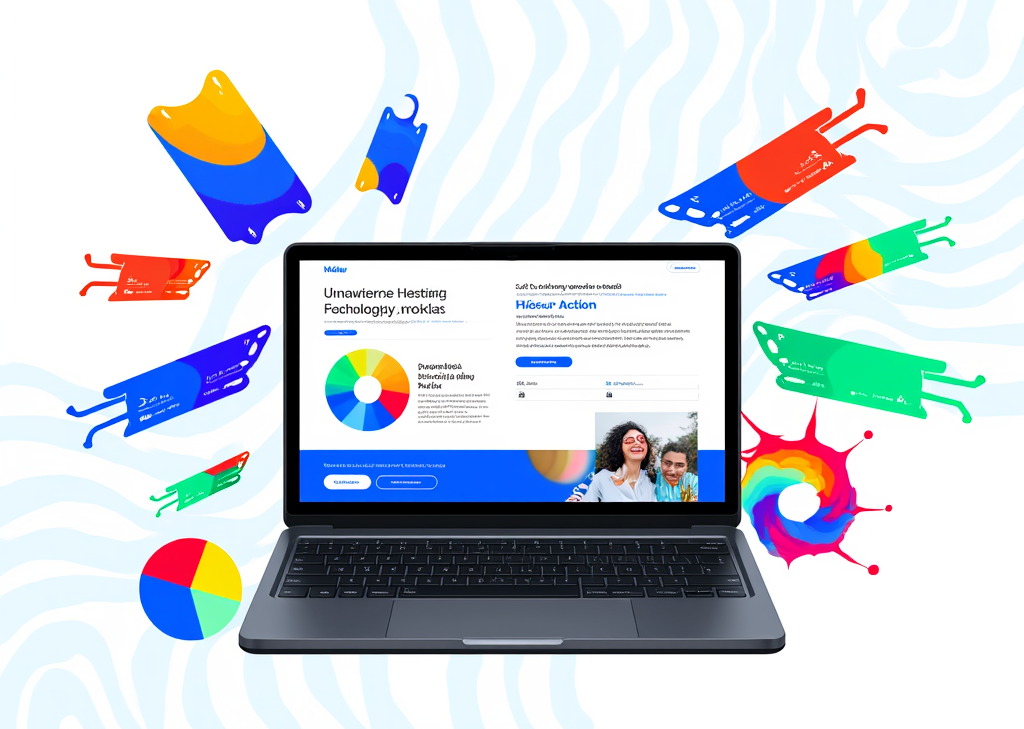
Visualize the classic color wheel, a spinning disk of hues where colors blend, clash, or sing in harmony. The color wheel serves as a fundamental tool, breaking down colors into primary (red, blue, yellow), secondary (green, orange, purple), and tertiary shades. This foundational knowledge allows designers to craft harmonious color combinations that don’t just look good but feel good to navigate.
Next, we have color harmonies. Here are some valuable pairings to consider:
-
Complementary colors: Found opposite each other on the wheel, they create bold contrasts that can energize a design. A red button on a green background? Sure! But be cautious – too much contrast can overwhelm and confuse.
-
Analogous colors: These sit next to each other on the wheel, creating a calm palette that’s pleasing to the eye. Picture a sunset—orange, yellow, and red blend seamlessly together.
-
Monochromatic schemes: Utilizing shades of a single color can provide a minimalistic approach, appealing to modern aesthetics, particularly in tech and corporate sectors.
What’s the emotional spectrum for each color category? Warm colors (like reds and yellows) radiate energy and excitement—perfect for grabbing attention. In contrast, cool colors (greens and blues) soothe and instill trust, making them ideal for service-oriented sites. Neutral colors—think blacks, whites, and grays—are versatile. They can balance vibrant palettes or convey professionalism, providing a calming anchor in busy designs.
Knowing your audience
However, it’s essential to remember one crucial factor: context matters. Colors can evoke different feelings based on cultural backgrounds. While red often signals danger in many cultures, it can denote celebration and happiness in others. By knowing your target audience and their cultural inclinations, you can craft a design that resonates deeply and meaningfully.
Accessibility is another pivotal theme. A visually pleasing website isn't just about following trends; it's also about ensuring every user can navigate easily. Using high-contrast colors ensures readability, catering to those with visual impairments or color blindness. Tools like the Adobe Color Wheel can be valuable allies in this pursuit, helping you strike the right balance.
Practical applications of color psychology
Ready to take your understanding of color to the next level? Here are practical strategies you can implement:
-
The 60-30-10 rule: This classic guideline suggests using 60% of your design space for a dominant color, 30% for a secondary color, and 10% for an accent color. This balance ensures emphasis without overwhelming the viewer’s senses.
-
Consistency is crucial: Your color scheme should flow seamlessly across all web pages. Establishing a consistent brand palette builds recognition and credibility, while inconsistency can confuse users looking for familiar branding.
-
Align colors with brand identity: Each industry has its color favorites. Green for environmental brands, blue for tech companies—it’s all about aligning emotions with visual identity.
-
Experiment with your audience: Different demographics react to colors uniquely. Younger users might prefer bold, vibrant colors compared to older users who lean towards softer tones. Use analytics tools to identify your audience and cater specifically to their preferences.
-
Use color to guide behavior: Colors aren’t just decorative; they can direct actions. For example, red-and-orange buttons often stimulate faster clicks due to their urgency while blue hues can instill a sense of security for registration forms.
As we delve deeper into this fascinating nexus of art and science, countless opportunities await in mastering the emotional language of colors on the web. The next step in this riveting exploration will unveil more nuanced techniques and concepts essential for harnessing color psychology to its fullest potential within website design.
FINDDOMAIN.GE (Internet services LLC) is a very interesting and rapidly developing IT company. The main directions are: web development, domain and web hosting. It also offers clients sub-services and outsourcing related to the main services.
BEST OFFERS:
Do you want to create your own company website or create your own online business on the Internet?
– WEB HOSTING
– DOMAIN REGISTRATION
– WEB DEVELOPMENT
– SITE BUILDER


Fine-tuning your approach to color psychology
As you delve deeper into the world of color psychology, it’s essential to recognize that emotional responses are not isolated to colors alone; they also depend on how those colors interact within a design. Think about the layout, typography, and imagery—each element contributes to the overall emotion conveyed. Start integrating these aspects by following some detailed strategies.
Integrating color with user experience
To create a holistic user experience, you need to integrate color thoughtfully with other design elements:
-
Typography and Color: Fonts can shift perceptions based on color choice. A bold, sans-serif typeface in red may demand action, while a soft script font in a pastel hue might evoke warmth and approachability. Consider how the font style complements the color palette to enhance the desired emotional response.
-
Imagery and Color Synergy: Images play a pivotal role in color preference. A playful, colorful image can amplify excitement, while minimalist black-and-white photos evoke elegance. Use imagery that aligns with your color choices to reinforce your message. Think about how your photo vibes with your palette and adjust accordingly.
-
Responsive Design: Color can change dynamically based on user interaction. Imagine a button that shifts from a muted gray to a vibrant orange when hovered over—this invites engagement while providing instant feedback. Such responsive hues make interfaces feel alive and responsive.
Testing and iteration for success
Testing your design is paramount. A beautiful design can crumble if it does not resonate with its audience. Here’s how to create a feedback loop around color choice:
-
A/B Testing: Roll out different color variations for buttons or backgrounds to see which yields better conversion rates. Which shade encourages more clicks? Which layout keeps users engaged longer? Gathering data from real users provides insights you simply can’t predict.
-
User Surveys and Feedback: After deploying your design, consider reaching out to your audience. Ask specific questions about their emotional responses to colors used. Did the blue header elicit trust? Did the green background produce a therapeutic feeling? Use qualitative data to refine your approach.
-
Following Trends Wisely: Color trends can change with new design seasons, but it’s important to keep your brand’s identity intact. While pastels may be all the rage this quarter, be cautious; if your brand speaks sophistication, stick to timeless palettes that resonate with your target audience.
The impact of storytelling through color
Colors are storytellers; they can weave narratives that hook users into your brand’s journey. Employ them strategically to narrate your story:
-
Sequential Storytelling: Consider a landing page that transitions through a color gradient tied to different aspects of your narrative. As visitors scroll, the site can guide them emotionally through a journey—starting with a warm, inviting tone and transitioning to cooler, calming hues as they near completion, subtly urging them towards conversion.
-
Call-to-Action Boost: Make those CTAs (Call-to-Action) pop! Use contrasting colors to draw users' attention right where you want it. The goal is to create a visual pathway that leads the eyes, making the journey on your site feel natural and intuitive.
Resources for further exploration
The study of color psychology is vast and ever-evolving, and there are countless resources to aid your exploration. Check out these engaging videos for an in-depth understanding:
- The psychology of color in marketing and branding
- Understanding color theory for web design
- Color psychology in web design: Tips and strategies
Understanding how to use color psychology in website design is not merely an aesthetic choice; it’s a strategic decision that can transform the way users interact with your brand. By applying nuanced strategies, integrating color harmoniously with design elements, and testing your choices, you can create captivating web experiences that resonate deeply and encourage lasting connections. The world of color awaits your creative endeavor—dare to dive deep and explore its remarkable potential.
References
For further reading, check these resources:
BEST OFFERS:
Do you want to create your own company website or create your own online business on the Internet?
– WEB HOSTING
– DOMAIN REGISTRATION
– WEB DEVELOPMENT
– SITE BUILDER


