<h1>WordPress for mobile: Responsive themes</h1>
<h2>შესავალი</h2>
In today's digital era, <b>WordPress for mobile</b> use is no longer optional but essential. The browsing habits have shifted dramatically. Now, most web traffic originates from smartphones and tablets, making the need for a robust mobile strategy paramount. Implementing <b>responsive WordPress themes</b> ensures your website adjusts seamlessly across devices, significantly enhancing user experience and boosting SEO performance.
<h2>მთავარი სექცია</h2>
<h3>What Are Responsive WordPress Themes and Why They Matter</h3>
**Responsive WordPress themes** are designed to dynamically adjust their layout, images, and navigation based on the device's screen size—whether it’s a desktop, tablet, or smartphone. Imagine a visitor scrolling through your site on a tiny screen. If they encounter a jumbled mess of links and text, how likely are they to linger? This flexibility eliminates the need for separate mobile versions of your website, simplifying management while maintaining a consistent brand presence.
- **Mobile dominance:** Did you know that over 60% of web traffic comes from mobile devices? That's not just a statistic; it's a loud wake-up call to anyone managing a website. Being responsive is crucial for capturing this vast audience.
- **SEO benefits:** Google’s mobile-first indexing means that the search engine values mobile-friendly websites in rankings. It's not just about looking good; a responsive design can reduce bounce rates, encourage user engagement, and minimize phenomena like "pogo-sticking," where users leave quickly due to frustrating experiences.
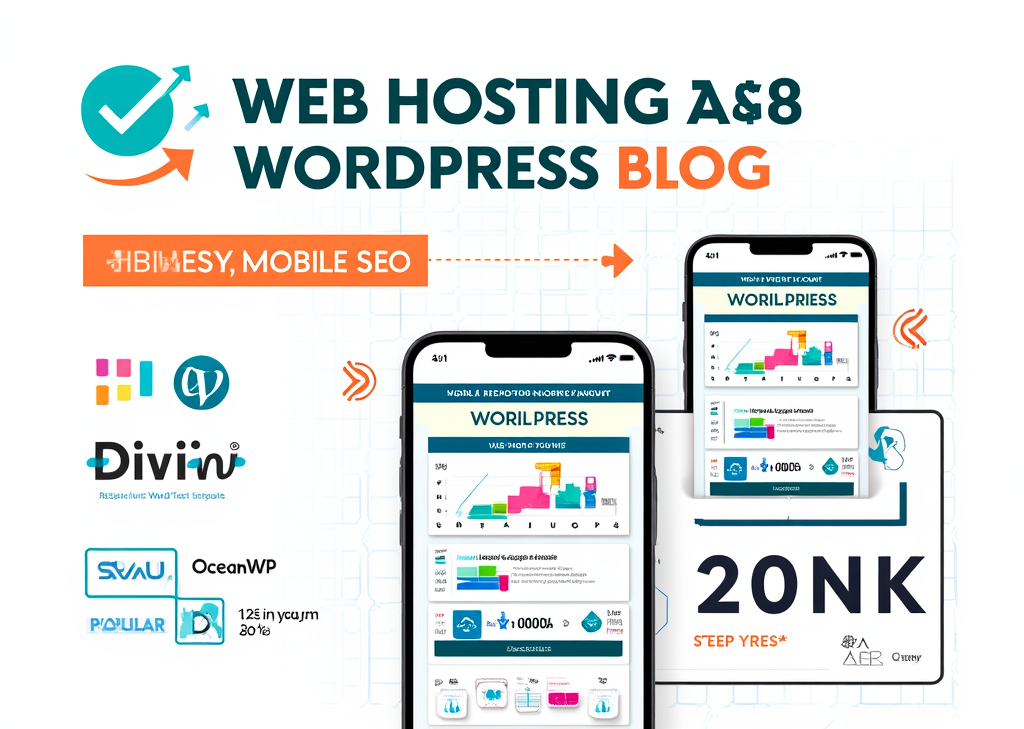
- **Examples of responsive themes:** Consider the following options that stand out in the crowd:
- **Divi:** This theme offers an intuitive drag-and-drop visual editor along with built-in mobile customization options, making it a go-to choice for many.
- **OceanWP:** Lightweight, fast, and WooCommerce compatible, it's perfect for both business and eCommerce sites, ensuring that speed and responsiveness do not compromise each other.
- **Sydney:** A popular free theme, Sydney features mobile-friendly header and footer builders, making it highly adaptable for different business models.
**Advantages of responsive themes include:**
- Automatic content adjustment, so text and images resize or rearrange for optimal readability.
- A consistent design and functionality that translates seamlessly across devices.
- Reduced maintenance overhead—why bother managing multiple themes when one can do it all?
- Enhanced user experience translates to longer site visits and an increase in conversions.
<h3>How to Ensure Your WordPress Site Is Mobile-Friendly: Practical Tips</h3>
Creating or maintaining a mobile-friendly WordPress site is crucial; it starts with selecting the right theme and extends to applying additional optimization practices:
- **Choose modern and regularly updated themes:** The importance of selecting themes that are likely to be mobile-responsive and compatible with the latest WordPress versions cannot be overstated. Outdated themes may hamper your overall website performance.
- **Test your theme for responsiveness:** Use different devices or browser developer tools like Chrome’s Device Mode to preview how your site looks across varying screen sizes. It’s one thing to guess; it’s another to see for yourself what your audience experiences.
- **Use mobile-specific plugins when needed:** Plugins like **WPtouch** can create mobile-only themes without altering your main desktop interface, particularly useful for maintaining a fresh mobile experience on non-responsive themes.
- **Customize mobile behavior effectively:** WordPress and plugins give you control over how menus present, how content stacks vertically, text sizes, and what elements to hide or show on mobile, so take advantage of these features.
- **Optimize load times:** Nobody enjoys waiting for a page to load, especially on mobile. Compress images and reduce file sizes (JavaScript, CSS, HTML) to enhance mobile loading speed.
- **Consider Accelerated Mobile Pages (AMP):** AMD plugins can immensely speed up mobile page loading and bolster your SEO scores.
- **Create a child theme for custom responsive design:** If you yearn for custom mobile layouts, begin with a responsive parent theme and utilize CSS media queries to target devices specifically.
<h3>Mobile-friendly WordPress Themes and Tools to Consider</h3>
<div>
<table>
<tr>
<th>Theme/Plugin</th>
<th>მახასიათებლები</th>
<th>Best Used For</th>
<th>შენიშვნები</th>
</tr>
<tr>
<td>დივი</td>
<td>Drag-and-drop visual editor, screen size customization</td>
<td>Versatile, all-purpose sites</td>
<td>Easy mobile customization from dashboard</td>
</tr>
<tr>
<td>OceanWP</td>
<td>Lightweight, WooCommerce support, fast loading, SEO optimized</td>
<td>Ecommerce, business sites</td>
<td>Compatible with top page builders</td>
</tr>
<tr>
<td>Sydney</td>
<td>Free, mobile-ready header/footer builders</td>
<td>Budget-friendly professional sites</td>
<td>Highly customizable</td>
</tr>
<tr>
<td>WPtouch</td>
<td>Creates separate mobile themes, easy menu/layout control</td>
<td>Non-responsive themes</td>
<td>Recommended by Google, free & pro versions</td>
</tr>
<tr>
<td>Jetpack</td>
<td>Performance, security, mobile theme options</td>
<td>All-around mobile performance</td>
<td>Combines speed and mobile view features</td>
</tr>
</table>
</div>
Additional plugins like **WP Mobile Menu** and **AMP for WP** further enhance mobile usability and speed.
<h3>Original Approaches to Mobile Responsiveness</h3>
Going beyond standard theme responsiveness, try these innovative strategies:
- **Content hierarchy tailored for mobile:** Make the most of the limited screen real estate by prioritizing essential content upfront, hiding or minimizing less critical elements to declutter the experience.
- **Progressive enhancement for mobile:** Begin with a simple, fast-loading mobile version, adding advanced features as needed for capable devices. This method prioritizes quick load times without sacrificing user interaction.
As a localized case study, let's picture a small eCommerce business using OceanWP with WooCommerce. With a responsive checkout process optimized for mobile shoppers, they directly increase sales conversions—a tangible proof that investing in responsive design pays off.
Visual elements recommendation: Consider including infographics comparing mobile traffic statistics or a responsive testing checklist. Tables like the one above help communicate key differences and choices quickly and effectively.
საუკეთესო შეთავაზებები:
გსურთ შექმნათ თქვენი საკუთარი კომპანიის ვებსაიტი ან შექმნათ თქვენი საკუთარი ონლაინ ბიზნესი ინტერნეტში?
– ვებ ჰოსტინგი
– დომენის რეგისტრაცია
– ვებ-განვითარება
– საიტის შემქმნელი


„html“
Practical Considerations for Mobile Optimization
When diving deeper into the realm of responsive WordPress themes, it’s essential to understand the granular aspects that enhance mobile optimization. Even the most attractive themes can falter if not properly configured for mobile accessibility.
Testing Responsive Design
To gauge responsiveness accurately, testing is key. Use tools like Responsive Design Tester or your browser’s built-in developer tools to simulate how your site looks on various devices. Don't just focus on resizing your browser window; make sure to check text readability, navigation usability, and the loading times of images and scripts.
- Cross-device testing: Ensure that your design is functional across popular brands and models. What looks good on an iPhone might not translate well to an Android device.
Key Mobile Usability Metrics to Consider
Evaluating your mobile site’s performance involves diving into specific usability metrics that can provide insight on user behavior:
-
Page load speed: Users expect pages to load in 3 seconds or less. Tools like Google PageSpeed-ის ანალიზი can assess your site and provide suggestions for improvements.
-
Click-to-call buttons: If you’re a service-oriented business, implement buttons that allow mobile users to dial your phone number immediately. This reduces friction and improves user experience.
-
Touch targets: Ensure buttons and links are appropriately sized for fingers. A best practice is to ensure touch targets measure at least 44 pixels high for easy tapping.
Content Accessibility and Readability
It's about more than just making your design look good. Content must also be easy to digest. Here are some actionable tips:
-
Readable fonts: Use font sizes that automatically adjust based on screen size. A minimum font size of 16px is often recommended for optimal readability.
-
Simplified navigation: Replace complex menus with a hamburger menu or vertical dropdowns to suit smaller screens without overwhelming users.
-
Optimized images: Use responsive image techniques (like the srcset attribute) to ensure that images adjust in size. This not only speeds up loading time but maintains visual integrity across devices.
Analyzing User Engagement
Understanding how visitors interact with your mobile site can shape your approach going forward. Use analytics tools to gather data about user behavior on mobile devices:
-
Bounce rate: A high bounce rate on mobile devices can suggest that your site is not meeting user expectations. Investigate which pages are causing users to leave.
-
Session duration: Assess how long users stay engaged with your content. If users are leaving quickly, consider revising your content setup or layout.
-
Conversion tracking: Set up goals to track actions you deem valuable, such as completing a purchase or signing up for a newsletter.
Future Trends in Mobile Responsiveness
As technology evolves, so do the trends in mobile-friendly web design. Here are a few trends to keep an eye on:
-
Voice search optimization: With the rise of AI assistants, optimizing your content for voice search is key. Think about how people phrase queries and adapt your content accordingly.
-
Dark mode availability: Users are leaning towards dark mode options for reduced eye strain. Check if your theme supports dark mode or consider switching to one that does.
-
Augmented Reality (AR) experiences: As AR technology becomes more mainstream, think of ways to incorporate interactive elements that enhance user engagement, particularly in eCommerce settings.
დასკვნითი აზრები
Embracing a mobile-first approach with responsive WordPress themes is not just a nice-to-have, it is essential in today’s digital landscape. From ensuring rapid load times to simplifying navigation, every detail counts. The journey to optimizing your site might seem daunting, but the rewards far outweigh the efforts. Think of happy customers swiping through your beautifully designed site, engaging with your content without a hitch. That scenario is not just a dream; it can be your new reality.
If you're looking for visual guidance on these issues, check out some useful resources:
Elevate your responsive design game today and ensure that your WordPress site resonates well with all visitors, leaving a lasting impression that keeps them coming back.
<a target="_blank" href="https://www.finddomain.ge/en/">FINDDOMAIN.GE (შპს ინტერნეტ სერვისები) ძალიან საინტერესო და სწრაფად განვითარებადი IT კომპანიაა. ძირითადი მიმართულებებია: ვებ-განვითარება, დომენები და ვებ-ჰოსტინგი. ის ასევე სთავაზობს კლიენტებს ძირითად სერვისებთან დაკავშირებულ ქვე-მომსახურებას და აუთსორსინგს.</a>
<br/><br/>
<hr>
<strong>
საუკეთესო შეთავაზებები:<br/>
გსურთ შექმნათ თქვენი საკუთარი კომპანიის ვებსაიტი ან შექმნათ თქვენი საკუთარი ონლაინ ბიზნესი ინტერნეტში? </strong>
<a target="_blank" href="https://www.finddomain.ge/en/hosting/">- ვებ ჰოსტინგი</a>
<a target="_blank" href="https://billing.finddomain.ge/cart.php?a=add&domain=register&language=english">- დომენის რეგისტრაცია</a>
<a target="_blank" href="https://www.finddomain.ge/en/web-development/">- ვებ-განვითარება</a>
<a target="_blank" href="https://www.finddomain.ge/site-builder/">- საიტის შემქმნელი</a>
</br>
<a href="https://www.finddomain.ge/en/hosting/" target="_blank" rel="noopener"><img src="https://besthosting.ge/wp-content/uploads/2025/08/hosting-banner_en.jpg" /></a>
</br>
<a href="https://billing.finddomain.ge/cart.php?a=add&domain=register&language=english/" target="_blank" rel="noopener"><img src="https://besthosting.ge/wp-content/uploads/2025/08/domain-registration-en.jpg" /></a>
</br>
<a href="https://www.finddomain.ge/en/web-development/" target="_blank" rel="noopener"><img src="https://besthosting.ge/wp-content/uploads/2025/08/web-development-en.png" /></a>
</br>


 Georgian
  English